PicMonkey Features
Collaborating with the desktop team I was expected to bridge the gap between them and the mobile platform. Utilizing my experience in desktop mobile and mobile app realm I worked on a few projects that would help unify and help a users workflow.
What's New Slider
Objective
To create a system for using the header/image carrousel space on the home page. Market & showcase new features within the app. (New Graphics, New fonts, Templates, BG Erase, ongoing tips, etc.) In addition, increase engagement in new/features we want to highlight for the lately release.
Current State
The promoted features scroll through but are not actionable. The users do not know where to find the featured tool. This current UX has limited functionality.
Design Solution
Create a system that would be scaleable when promoting new features in the mobile app. Utilize existing UI to educate and direct users to the specific feature. Create UI/UX clarity within the app.
Static Image: Self explanatory feature. Current state.
MP4/CSS Animation: Visually exemplify a new tool. This gives the user a better idea of the usefulness of what we’ve improved on.
Button Overlay Modal: More advanced for on-boarding a user to a more complex tool within our app.
Botton Deep-link (future feature): Users will be directed to the tool/feature to improve workflow.
Take Away
As this was something I spoke of implementing from my interview, I was very happy in being able to see it through fruition.
The goal was to use the carousel as a marketing piece to potentially open new doors to a users design. With creating a system it allowed me to understand the app currently and where we can take it. The system will help define how the marketing team will promote the feature. I collaborated with engineers and my director to write the spec to make sure that this would make the most impact without being too overbearing design wise.
Color Wheel
Objective
(Original request) Port over the color wheel from another app.
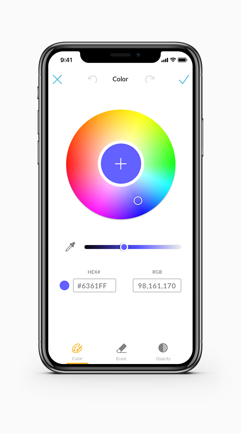
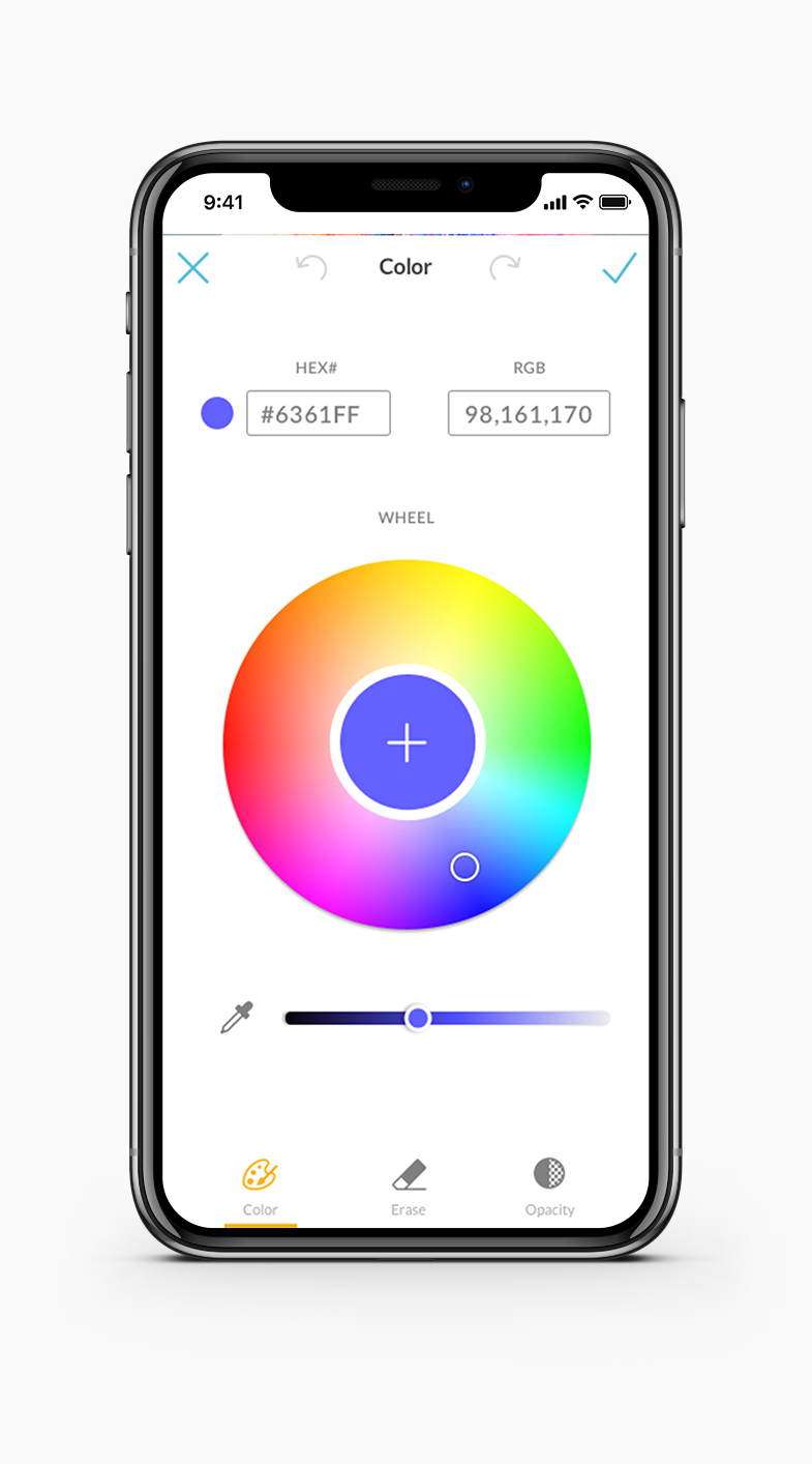
Exploration of the color wheel and how users are selecting color within PicMonkey.
Research
Usage of each color picker tool.
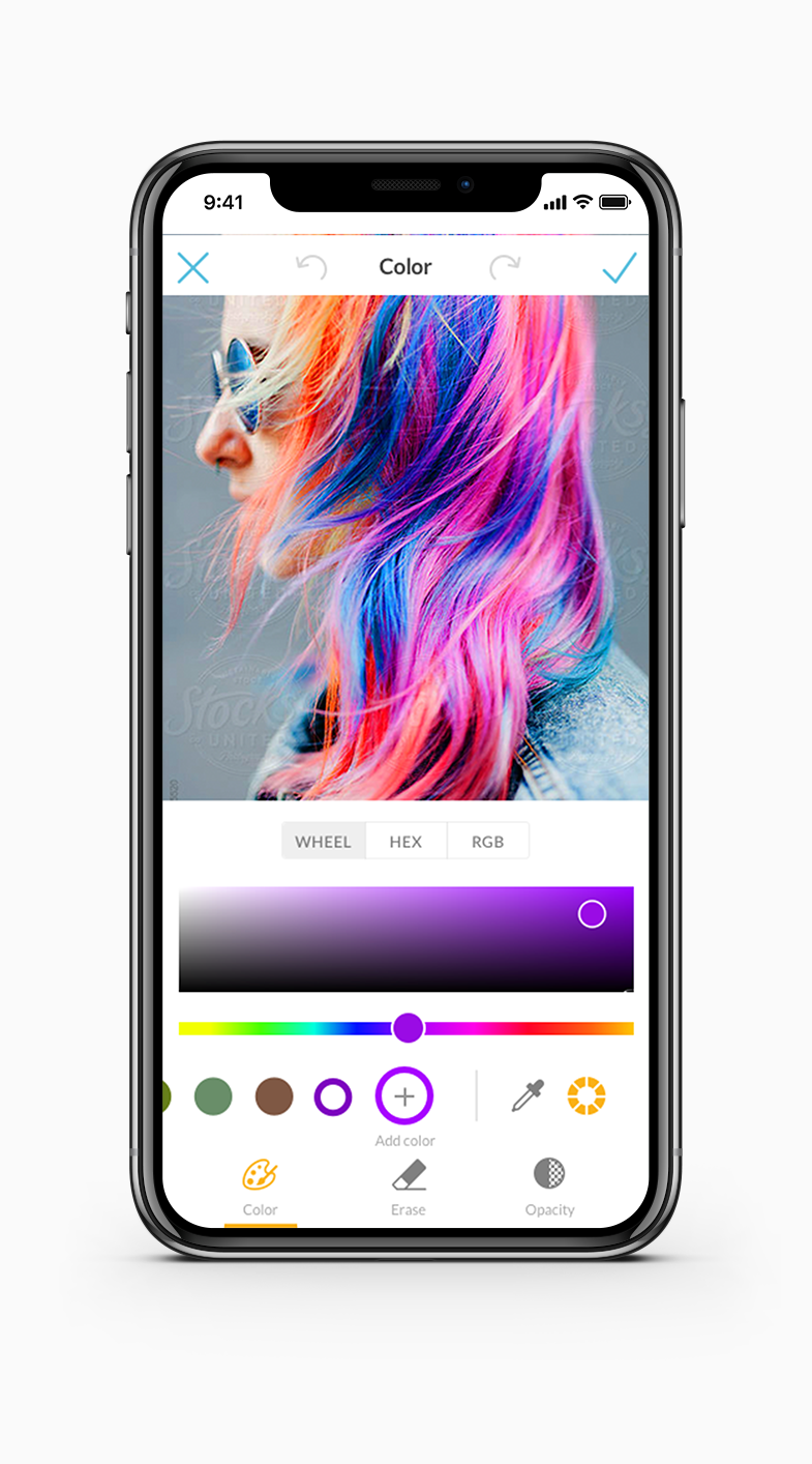
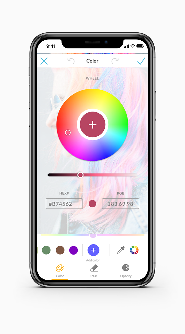
Old Color Wheel & Iterations
Originally the task was to port over this color wheel that was in development. However, after user feedback and understanding UX within the app already that did not make sense to implement
Design Solution
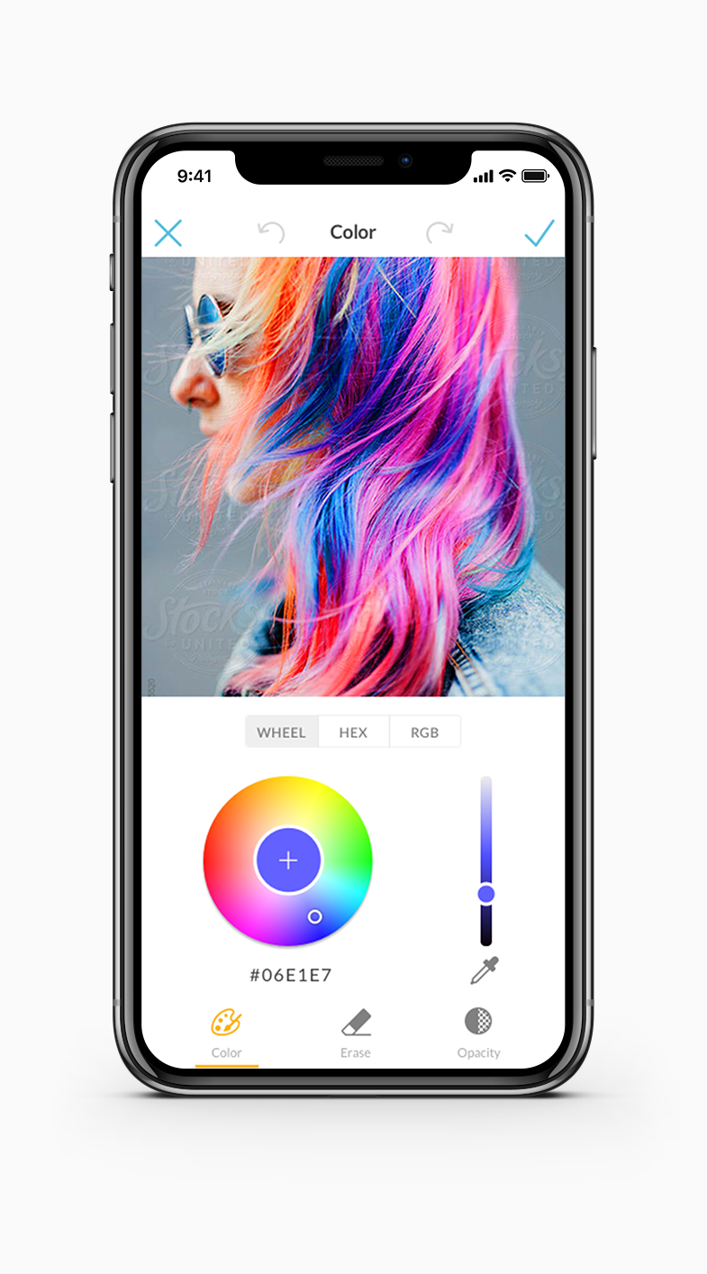
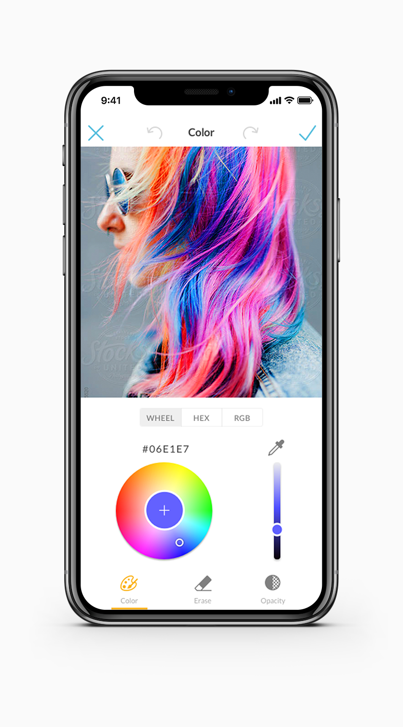
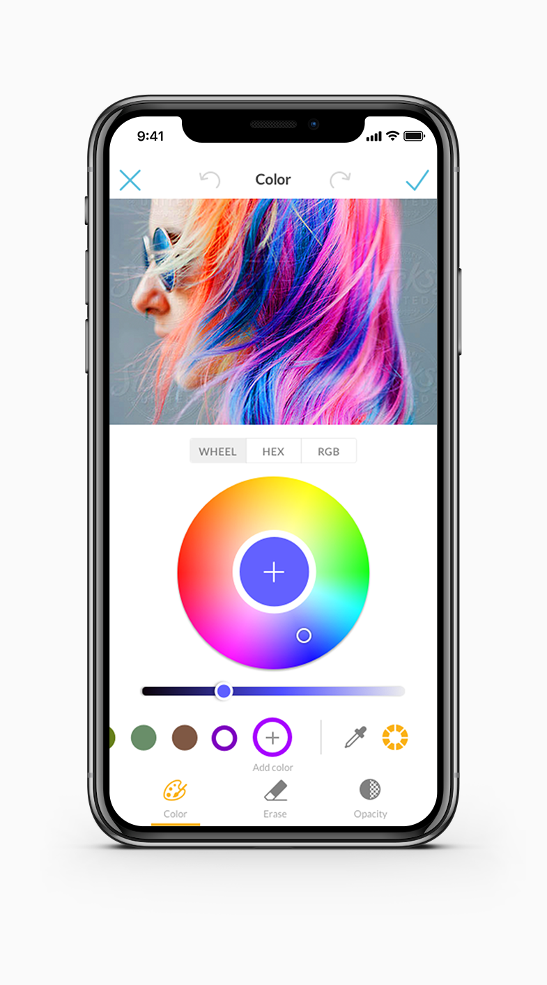
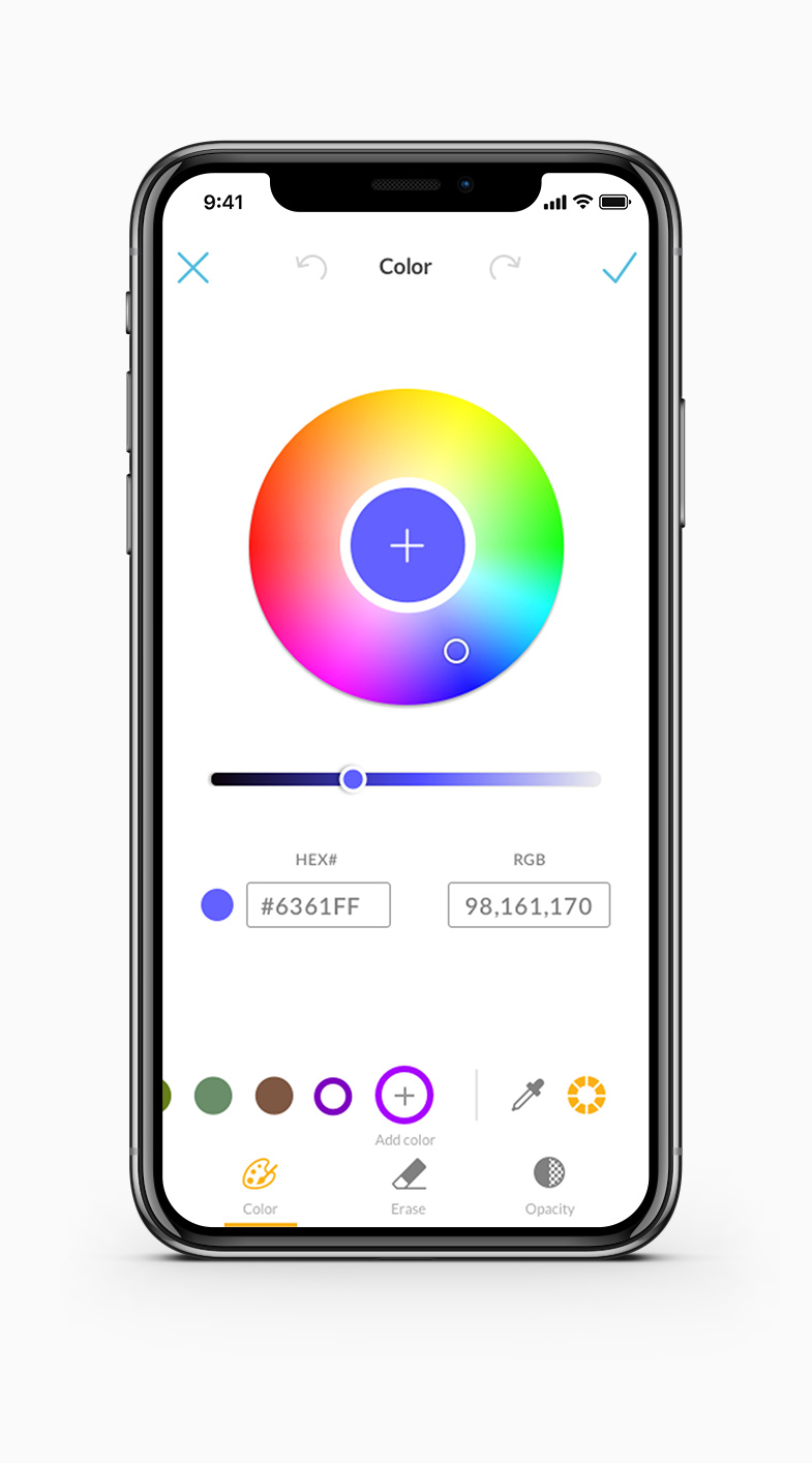
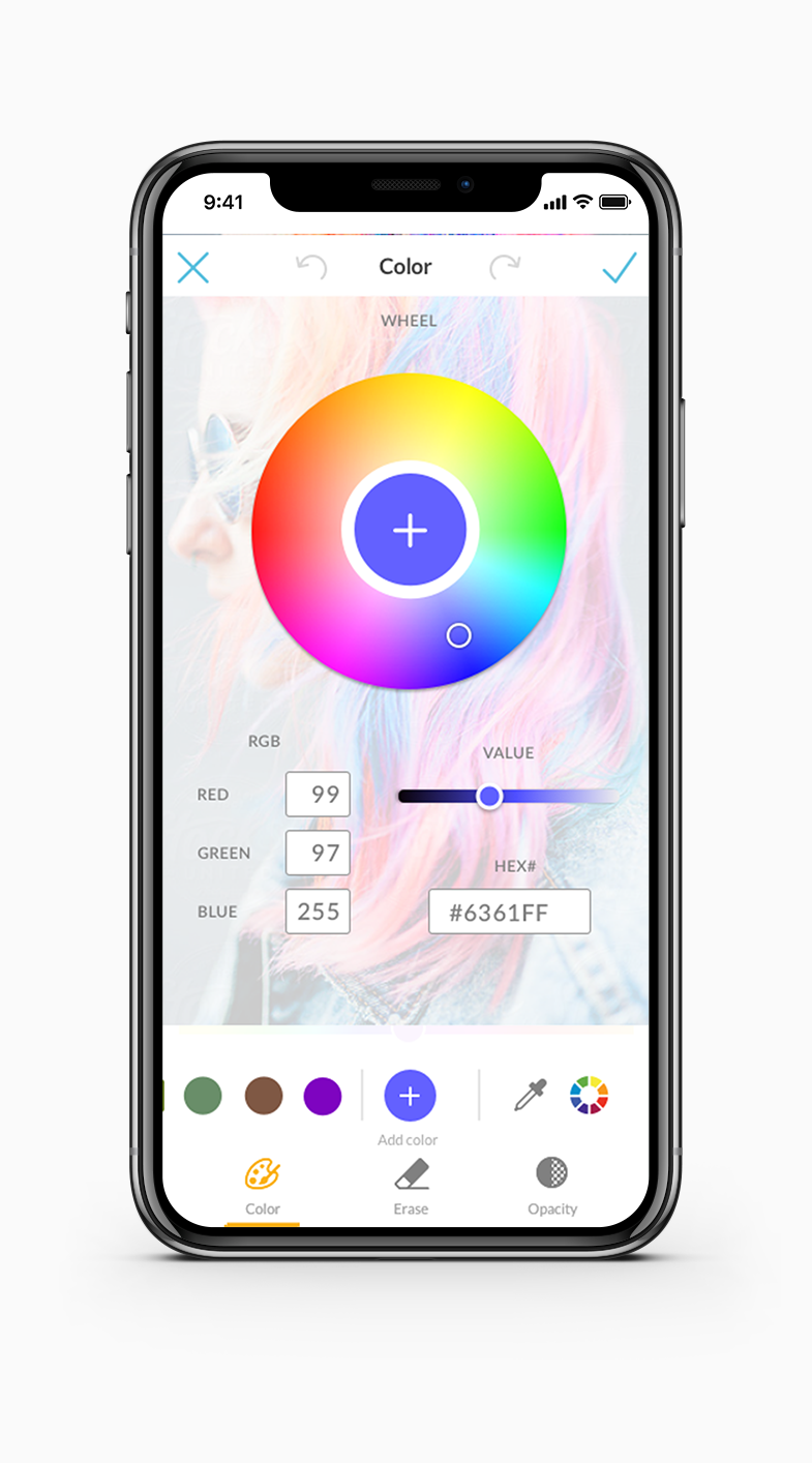
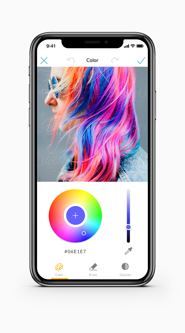
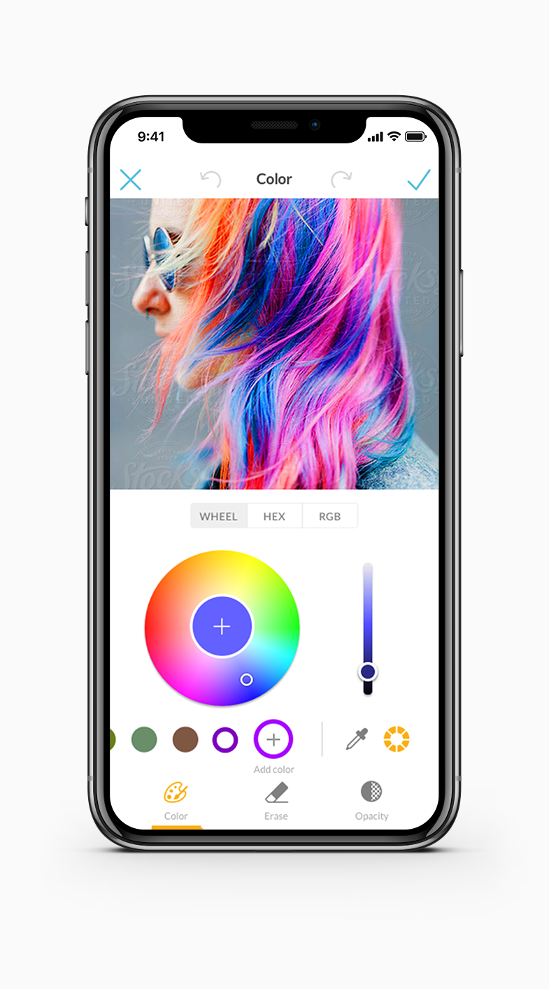
Prioritize the color wheel and eyedropper tool within the color picker tool. I adopted elements of the desktop color wheel for uniformity between both apps. In addition, I utilized existing UI patterns within the app and just reorganized how certain interactions with them would be and build a better visual hierarchy for color picking.
Take Away
I worked a lot with the desktop team to pinpoint a lot of UX discrepancies between the two platforms. This project bridged the gap as they did not know too much about the mobile features. It then because a point of emphasis to align with them weekly on projects we were working on so we could build a more cohesive product. We solved the problem quicker than I expected and became more collaborative within our company from this project.
Font Picker
In Progress…
Other Features
In Progress…


